Tuesday 6 December 2011

Exercises

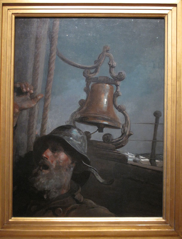
Not a lot of time this week so I decided to keep going by trying a couple of exercises. The first one is something I promised my friend Dan Corey that I'd be having a go at some time soon. The object of the exercise was to observe the range of values in an object and render them in monochrome. Value recognition and rendition are at the heart of producing convincing images in paint and concentration on colour often have one forgetting the importance of values.

To do this I first of all mixed a range of greys so that I had them to hand and could concentrate on observation. The concentration required was intense and I was totally absorbed maybe to the point of convincing myself that there were value shifts that weren't there.

As an aside, I produced this work on a gesso panel, the first time I'd used one, and was surprised at the way it sucked in the paint rendering it almost dry in a short space of time.

Value vase - Oil on gesso board 6" x 6"

The next exercise that I tried was more an attempt to familiarise myself with some new acquisitions, some squirrel mop brushes. I came to buy these after a conversation with fellow artists, Colin Joyce and Peter Dimmock. They came along to introduce themselves during the recent Art Fair. During the chat they enthused about having worked on courses with Alvaro Castagnet and also of their admiration for the work of Joseph Zbukvic. I also enjoy the work of these two so I dug around in my library and the various video clips on the internet to find out a little more about their working methods. Central to the approach seemed to be the creation of large washes of colour laid down with mops, particularly Castagnet. Never having used them I decided to pick up a couple of mops from my local art store.

Brushes in hand I discovered a Zbukvic demonstration in one of my books and decided to have a go. The brushes felt really unfamiliar, my usual tools being Kolinsky sables. Judging the amount of pigment to add to the large reservoirs of water held by these brushes was something of a trial. The one thing I learned was that it would take a bit of practice to get the hang of the technique. The feel of the softer fibres lends itself to a much looser approach and from that point of view make the effort well worth while so I'll persevere. Anyway the attempt is below, crude though it is.

Venice Fish Market after Zbukvic - Watercolour on Not paper 12" x 10"

Tuesday 29 November 2011

November Challenge.

Pemaquid Wave - Photograph

This month's challenge subject shared with my friend Peter Ward, (watercolourfanatic.blogspot.com). I set the challenge with the photograph above. It is a shot that I took whilst in Maine last month. As is too often the case I became pressed for time and don't think I've given this the attention that it deserved. Art fair and house guests along with the usual grand parenting tasks seem to have eaten up the month.

What would I have done differently given sensible planning? Well the first thing would be to do a test strip on how the various hues worked together. First mistake was to choose the wrong blue as the basis for the sea. It jars against some of the hues. I tried to kill it a little by putting on a second wash and it's not as successful as I'd hoped. I was pleased that I decided to crop the sky out of the picture as it would have created another horizontal line across the picture. Some of my mixes didn't work out first time, again something that could have been remedied by testing beforehand. Just a bad day I suppose.

Pemaquid Wave - watercolour on Rough paper 14" x 11"

Sunday 20 November 2011

North East Art Fair

Once again the North East Art Fair has come around and I set up stall to see how my works were being viewed by the local public, always an interesting experience. And this year was another learning day that left me with some suspended questions.

The good thing was the positive feedback that certain images garnered and I had some interesting conversations about subject matter, painting style and presentation of pictures. Another good thing for me was a sale and a strong expression of interest in another piece. Not as good on the sales front as last year but I was expecting nothing in the current climate.

That brings me to the main question that I came away with, should we artists reduce our prices to reflect the reality out there? It was clear from some of the pricing adopted by some of the other artists that they were gambling on lowering their prices to make sales. In fact there were one or two whose pricing was little more than the cost of their frame. I'm not sure that this makes any sense at all but I would love to hear what other artists think of this.

My collection at the North East Art Fair

Thursday 17 November 2011

More Flowers

While the flowers are still round the house it is tempting to continue working with them. This has presented me with a problem that I hadn't thought of until Ray commented on my last post. I was a little dissatisfied with the last effort and felt even more so with the first of these. The reason being they have a tight feeling about them that makes them look a little laboured.

Regular readers will recognise the same old problem, a difficulty in remaining loose throughout a painting. The only reason I can think of relates to moving between oil and watercolour. The two media require different considerations in technique and it has become clear to me that I need to think a little more carefully when shifting between the media.

Bouquet 2 - Watercolour on Not paper 14" x 11"

The next one is a study of one flower extracted from the bunch. An exercise in wet into wet. Choosing the right moment to introduce the second colour and getting the correct consistency of paint are the two challenges in this process. I'm not too unhappy about the way these experiments have worked on this one.

Rose - Watercolour on Not paper 14" x 11"

Wednesday 16 November 2011

Bouquet

Sheila brought in a bouquet and when I said the I'd be constructing one of my usual still life arrangements she responded by suggesting that I concentrate on the flowers themselves and forget about other distractions. So I decided to take up that idea and fill my sheet with what lay in front of me.

Bouquet - Watercolour on Not paper 16" x 12"

Monday 14 November 2011

A few final tweaks

Made a few little adjustments today. Altered shadow shapes, put in some extra darks, greyed some of smaller rocks and softened the base of the main stack. Just thought I'd post it to see if anyone thinks the changes make a difference.

South of Marsden - Oil on canvas board 20" x 16"

Sunday 13 November 2011

South of Marsden

Having got on a bit of a roll recently, drawing and painting, I decided to try a studio piece based on a plein air oil sketch that I'd done earlier in the year. After my first pass at this I posted it on Wet Canvas as a 'work in progress' and I received some good feedback in terms of how it might be improved. After incorporating these I am starting to feel that it is moving towards a finish, so here it is. As with all these works, I like to sit back for a while before deciding that it is finished. I always welcome any criticism or suggestion about pieces that I post.

South of Marsden - Oil on canvas board 20" x 16"

Tuesday 8 November 2011

Keep on Drawing

Another drawing, same model, my partner in crime, musician and artist Jed Grimes. This one looks a little more like him than the last one. Done with a 0.5 HB propelling pencil.

Jed - Graphite on Cartridge paper 8" x 6"

Saturday 5 November 2011

Keeping One's Hand In

In all of the hurly burly of life it is often to easy to neglect the basics of one's craft. When time constrained it is not unusual to dive straight into the paint pots without the best preparation and it is even easier to forget about honing the important underpinnings of our craft by missing out on drawing practice.

So this week's post is a little reminder to myself that I should do it more often. Sketch of a friend of mine done on Thursday evening. It isn't a great likeness but is a better effort that some of my recent portrait attempts which are littered with school boy errors. What is they say about practice?

Jed - Graphite on cartridge paper 8" x 6"

Saturday 29 October 2011

Competition Answers

Thought I'd better post the answers to the competition I set a couple of weeks ago. There were only a couple of responses that showed a real familiarity with the pieces posted. One of them had almost all of them including their titles, but no one had them all. Consequently no prizes awarded. I've reposted the pictures with the names of the artists below. It would be a good little exercise to try and put a title to them all. No! I'd rather paint as well.

Thanks to those who were in touch with their efforts. Ian Wright made the best attempt and other than missing out one and not getting the photographs just about had everything else, including titles, correct. Well done Ian, not just a good artist but a knowledgeable student to boot.

Picture 1 - Edgar Degas

Picture 2 - Edgar Degas

Picture 3 - Andrew Wyeth

Picture 4 - Norman Rockwell

Picture 5 - Edward Hopper

Picture 6 - Edward Weston

Picture 7 - Georgia O'Keefe

Picture 8 - John Singer Sargent

Picture 9 - John Singer Sargent

Picture 10 - John Singer Sargent

Picture 11 - Albert Bierstadt

Picture 12 - Winslow Homer

Picture 13 - Winslow Homer

Picture 14 - Frederic Edwin Church

Picture 15 - Joseph Mallord William Turner


Tuesday 25 October 2011

More Maine

As is my habit, when I'm out and about there is a watercolour sketch book and my trusty Craig Young Sketcher's Box with three Da Vinci travel brushes somewhere about my person. And the opportunities raised themselves one after another to collect a little rain water and work the paints.

In my last post there was a photograph of Owl's Head lighthouse. What I didn't say at the time was that by the time we reached it there was a howling gale and it was very difficult to find a surface to rest against so I was quite pleased to get anything down at all, but here it is.

Owl's Head Lighthouse - Watercolour on Not paper 12" x 8"

As mentioned in the previous post, Dan Corey and myself painted at Pemaquid Lighthouse and I had to return there with Sheila so that she could enjoy the spot and as she wandered the site I sneaked out the sketch book again.

Pemaquid Lighthouse - Watercolour on Not paper 12"x 8"

Sunday 23 October 2011

Maine Escape

I've just got the chance to write a few notes and post a few pictures in relation to this wonderful place, Maine.

First of all, I must introduce a fabulous guy and brilliant artist, Dan Corey. If you haven't seen his work, get him Googled. I met Dan in cyberspace some time ago in the land of Wet Canvas as I started posting early attempts in oil and early plein air work. Dan chipped in with helpful and encouraging comments and I was extremely flattered that an artist of his talent would take the time and care to help a novice like myself. We've been in touch ever since and it was with some excitement that, having planned a trip to his part of the world, I was able to arrange a meeting.

It wasn't just a meeting. Dan had offered to take receipt of some art materials that I ordered from a couple of suppliers in the State. He also offered to loan me some gear to use whilst on his patch. Our meeting took place at the weekly meet of the Plein Air Painters of Maine, a friendly bunch of keen artists who were working on a farm site near Boothbay. It turned out to be a great day, much conversation, plenty of seeing the techniques used in this part of the world and then a long chatty lunch after the rains came. We arranged to meet a couple of days later to paint together at Pemaquid lighthouse.

Mick and Dan

After all it is the Fall so instead of lots of panoramic shots, here is the essence of the season. In truth this year has been less than the best for colour but it is still spectacular and well worth the trip.

The Fall

Lighthouses are a fascinating feature of the Maine coastline and it's difficult to travel anywhere without being drawn to see them in their exposed positions. They also make good subjects for painting.

Owl's Head Lighthouse

More of this one later.

Pemaquid Lighthouse

This fellow was to be the venue for our little painting jaunt. Up early and out to catch the best of the morning light.

Dan with his morning's work

The rocks below the lighthouse.
Pemaquid Point

I also got out the brushes, a new bunch from Utrecht, and splashed the oil about.

Pemaquid Lighthouse - Oil on canvas board 12" x 10"

Another fine morning gave me the opportunity to use up a little more of that oil stuff.

Ocean Point - Oil on canvas board 12" x 10"

I'm afraid that's all I have time for this evening, Lobster Dinner is calling.

Tuesday 18 October 2011

A Competition for my Readers

Everyone should get across to the States and visit some of their wonderful museums and high on the list of any visitor should be the Museum of Fine Arts in Boston. Sheila and I had a day there yesterday, as well as the doing the Cheers pilgrimage, and I'd forgotten what a treasure house it is.

As well as a stunning exhibition of Degas works the permanent collection is one of the best in the world. Very strong on the great Europeans but fabulous on the variety of great Americans and it was those that I particularly wanted to see as many of them are ill represented in our European galleries. For example I'm only aware of one Church painting in Europe and that is in the National Gallery of Scotland and it's one of his best, a stunning picture of Niagara Falls. Another must - see.

I thought of spending a lot of time producing my response to these images but chasing our luggage around New England has curtailed blogging time so I thought a little competition wouldn't go amiss.

So here they are and the first reader to identify all of them wins the star prize, a little gift from myself. That should kill the interest.

Good luck.

Picture 1

Picture 2

Picture 3

Picture 4

Picture 5

Picture 6

Picture 7

Picture 8

Picture 9

Picture 10

Picture 11

Picture 12

Picture 13

Picture 14

Picture 15

Some real eye candy in that lot, eh?