Tuesday 25 September 2012

Scolt Head

One of my favourite places to visit is the North Norfolk Coast, an area much loved by all sorts of artist. I've just recently returned from a short break in that part of the world and as usual taking an opportunity to paint was part of the plan.

I first became familiar with this part of the world when I decided to learn a little about oil painting and enrolled on a course at the Norfolk Painting School run by the estimable Martin Kinnear. Martin is expert in the wide range of techniques used by the Masters as well as being a fine painter. I can thoroughly recommend taking a course there or just a visit to see Martin's work. Alternatively have a look at the websites,  www.norfolkpaintingschool.com and www.makinnear.com .

One of the delights of the area is the ever changing sky and this is emphasised by the relatively flat landscape. The picture here was made at a place I've painted in the past, Barrow Common. One of the few hills in the area it gives a great view down to Brancaster Staithe and across to Scolt Head. I've employed a little licence here by exaggerating the size of Scolt Head and reducing the number of buildings visible from my chosen spot in the hope of making a better image.


Scolt Head from Barrow Common - Oil on canvas board 12" x 10"

Monday 17 September 2012

New Brush and Painties

Apologies for the very bad heading to this post, a play on the title of an album recorded by an English band back in the seventies. Can anyone guess the artist and year? However, it is meant to indicate what's been going on at Chateau Carney over the last few days.

As you will remember from my last post I've at last succumbed to the lure of the wonderful range of art materials available these days. The main thrust of this post then will be to talk a little about the experimenting I've been doing. 

Instead of the swatches that I posted last week I thought I'd try to place the experiments in context and whilst not intending to produce a completed painting at least try to make the semblance of a picture. But before that let's look at some of the aspects I was trying to explore. One thing that's important in watercolour painting is the technique of placing paint and then softening an edge. Different pigments behave in a variety of ways when doing this. The first picture is a new pigment to me, Daniel Smith Amethyst Genuine. You can see that in this case the pigment has not migrated a long way and that is something for me to remember when using it again. It is an intriguing pigment, when viewed at an angle it appears to have particles that shine within it.


Amethyst Genuine by Daniel Smith

The next picture shows a section of a pigment called Moonglow by Daniel Smith. This one is in fact a mixture of two pigments, a blue and a red but what is interesting is the way the two pigments behave when in a wash. Effectively they separate and you can see both colours on the paper. This puts a new slant on the technique of mixing on the paper and ensuring that the colours retain their own individuality. In the picture you can see the pink/red colour migrating more quickly than the blue.


Moonglow by Daniel Smith

The next pigment on show here is another Daniel Smith creation, Sleeping Beauty Turquoise. This is a more straight forward pigment, nice and clean colour with a nice granulation settling in the depressions of the paper.


Sleeping Beauty Turqoise by Daniel Smith

The next picture taught me another lesson. I made a mix of Green Apatite and Indian Yellow to place some green on paper that was damp and what I found was that the Indian Yellow migrated out of the mixture and produced a yellow edge. I don't know why this surprised me having messed with chromatography techniques in a laboratory during working days. More work to be done where best to use mixtures and what effects to expect.


Indian Yellow goes walkies

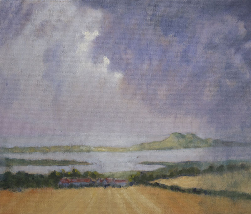
The last picture is the source of all of the above extracts. 


Flowers for Learning - Watercolour on Rough paper 

I've been reviewing other bits and pieces in my painting kit and the brush has not escaped some attention. My favoured style of brush almost since starting to paint has been the sable brush. Recently noticing the numbers of artists using other types I decided to give some others a go. To be brief I started with some artificial and hybrid types and quickly rejected them as not holding as much pigment or releasing it as smoothly as my sables.

The next brush to try was the very popular Petit Gris used by many well known painters. I watched a couple of DVDs where they were the main brushes used by the artist and found this helpful in terms of the appropriate techniques to use. However, I found that even though I persevered it was not easy to shift between broad wash techniques and more delicate application. There was less control over the release of pigment than with the sables. They do encourage a loose technique and I won't consign them to the reject bin.

Once I'd confirmed my prejudices with regard to sables I decided to splash out and award myself a gift. I've had my eye on a Da Vinci Artissimo for some time and made up my mind that now was the time to dive in. A quick phone call to Jackson's and the die was cast.


Sable Selection - W and N size 8, Da Vinci Series 10 size 8, Da Vinci Artissimo size 2, SAA Kolinsky size 10, Da Vinci Series 10 size 12.


Head of Da Vinci Artissimo

I must confess to having fallen in love with this new brush. As you can see from the photograph the size of the head is similar to that of the Size 10. It holds a bucket of pigment and releases it as smoothly as you would like and it points magnificently. What's not to love?


Isabey Petit Gris size 6

Wednesday 12 September 2012

Across Ullswater

A couple of posts ago I was looking at the green mixing problem and having gained a little confidence from the experimentation I decided to have a go in the fresh air. We spend little bits of time over in the Lake District and it's always a delight to get out in the fresh air in that wonderful part of the world.

We stay near Ullswater and there are so many stunning views along it that it's often difficult to choose a spot to paint from. This view can be seen towards the head of the Lake. 

The green mixes are combinations of Ultramarine and Cerulean Blues with Lemon Yellow, Cadmium Yellow and Yellow Ochre. I found it helpful to make my mixes prior to beginning the application of paint. his gave me the opportunity to compare them on the palette board and speeded up the actual laying on of the paint.


Across Ullswater - Oil on canvas board 12" x 10"

Sunday 9 September 2012

New Paints in Box

I've been doing a bit of reading recently, books and blogs, and have been struck by the variety of colours and manufacturers that people use. Before now I've been fairly conservative in my selection of pigments using most of the standards that appear in most boxes, resisting the temptation to branch out. That is until the last few weeks. In a fit of artist envy I decided to have a splurge on a bunch of paints that until now had been a mystery to me. I was particularly attracted by what I was reading of Daniel Smith paints and on investigation was bewildered by the range. I've long been a Winsor and Newton man not seeing any reason to wander. So what to buy? Looking at the work of some artists that I admire I drew up a short list and sent for the selection. Exotic names like Sleeping Beauty Turquoise, Green Apatite Genuine, Amethyst Genuine, Perylene Maroon and a bunch of Quinacridones.

Having taken delivery of the new 'toys' I set about investigating what they were like. This is an interesting process as I'm coming across characteristics that are new to me. As an example of what I mean I've posted a few pictures here of some swatches made with one of the new ones, Green Apatite Genuine. I ordered this colour, having read that Yvonne Harry (watercolourflorals.blogspot.com) was using it as the basis of her greens in her wonderful flower paintings. The main characteristic of this pigment is the degree of granulation that occurs. Whilst many pigments granulate I've never come across one that does so in such spectacular fashion. It's giving me quite a bit of food for thought as to how I will use it in future. 


Green Apatite with Winsor Yellow


Green Apatite with Cadmium Yellow Light


Green Apatite with Burnt Sienna

In the photographs you can see the aggregations of small dark particles that deposit whenever this pigment is used. 

Playing about with swatches is interesting but the real fun is to be had in making images and so on to put the new paints to use. I decided to carry on with the Iris project and selected a bloom that might use some of my new acquisitions.


Iris - Watercolour on Rough paper 16" x 12"

Monday 3 September 2012

Starting to Adjust the Iris

Having received lots of helpful advice when I posted this picture asking for help, I decided that it was about time I paid it another visit. All of the advice received had a point to it, although once I sat and studied it all it was clear that some suggestions could not happen at the same time as some others. This created another layer of problems to solve. What to do?

The first thing I decided upon was to begin glazing the background in the hope that I could calm it down a little without losing the texture and hint of some colour variety. I decided upon this as the alternative of darkening the whole background and losing all of the interest there seemed higher risk as it would a step that couldn't be reversed with any ease. The approach I selected had the benefit of being gradual and could be built upon, stopping as the desired effect was achieved. 

Next I strengthened the colour in the petal that sits behind the stem but not enough to compete with the two at the front. Hopefully this gives a sense of recession.

The biggest difficulty as I saw it was getting the upright standards to read sensibly. The original photograph had the front one in shadow with a little more light on the ones behind and the way I'd painted it there was too great a value shift between them. My preference would have been to start again and leave them all nearly white with subtle shadow work to emphasise the texture and ripples but getting back to white paper on such a scale was too much to ask. So I chose to close the value gap and attempt to create a little more variation in the front standard in particular by a little judicious lifting out.

Lastly I introduced a few touches of gouache to emphasise the white edges to the falls.

There is nothing really dramatic in what I've done and I'll set it aside again to reflect on whether more surgery is required. I'd be delighted to hear what you think of the changes so far.